The Wind Archives
Cairo, Egypt
Art Exhibition


The Wind Archives is an installation piece in downtown Cairo inspired
by Itaru Sazaki’s Wind Phone installation. The ability to vocalize grief, loss, and
shame in a safe way so that we can feel less alone. This is particularly important for a space like Cairo that has a duality between the public appearance one must maintain and the private real self that one must hide away.
The project intends to provide a safe and inviting space that provides a sense of relief for whoever chooses to participate.
Cairo is a mega city with a population of over 9.54 million people. From the working class that comes into this part of the city to make ends meet to the more educated and upper-middle-class that have expendable income.
The moment is about the experience and its intersectionality.
Year & Sector
2022 | Art Exhibition
Services
Brand Strategy and Naming
Identity Design
Custom Illustration
Merchandise
Environmental Design
Website and App UX/UI Design
Collaborators & Designers
Marie-Jean Berger, Artist
Sara El Kadi, Graphic Designer
Imene Ben Youssef, Graphic Designer

Visual Concept: Celestial Beings
The vast and deep sky symbolizes a wise and comforting abyss that plays
a significant role in astrology, religion and science. As we encourage our participants to release their deepest darkest secrets and thoughts, we wanted to create an environment that felt intimate yet safe to do so.
The hero color of the visual identity was Egyptian Blue*. The Ancient Egyptians were able to manufacture this rare color that symbolized the sky, the Nile river, creation and divinity. We paired it with an electric yellow-green that has a more contemporary feel.
*Referenced from The Secret Lives of Colour by Kassia St. Clair
Logo Concept:
We were lucky enough to get our hands on a custom made Arabic font from the American University of Cairo students. The font is called Madinet Al Bat inspired by the typography of Downtown Cairo. We loved the slanted and unapologetic strokes that gave it a big personality. Much like the city of Cairo itself. We paired it with a more archival and gritty typewriter font called 29LT Makina which we used in both Arabic and English.
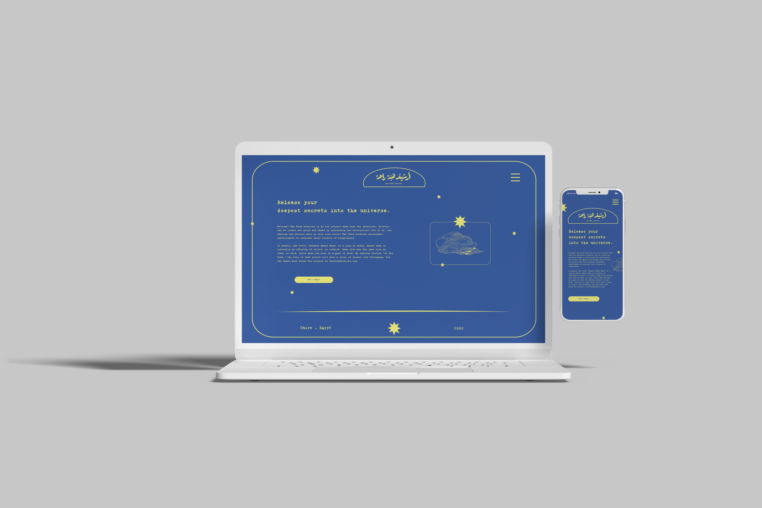
We built an interactive website and application (In both Arabic and English) for the exhibition, so that people who were not comfortable going to the physical site could contribute privately through the virtual platform.


Panels designed for the Phone-booth in both
English and Arabic to be printed on vinyl and mounted on colored plexiglass.
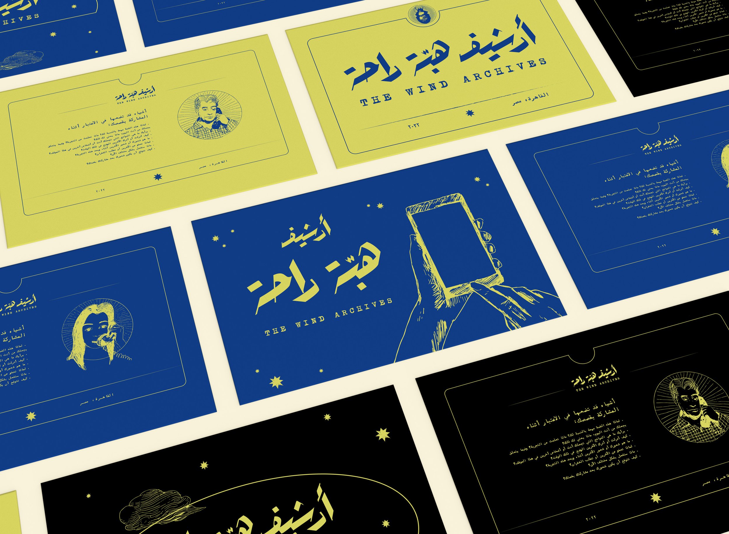
The illustrations are custom made by the artist herself, Marie-Jean Berger.
We used both Arabic and English typography for the entire brand rollout.
We chose the font: 29LT Makina to create a consistent typographic story while designing in the two languages.


