
Herbology
Health Conscious Restaurant
Doha, Qatar

Herbology is a food venture based in Doha, Qatar catering to health-conscious Qataris that would like no-nonsense accessible nutritious meals.
Target Audience: between the ages of 20-50+ years old. Health-conscious Qataris and Expats that care about what they’re putting into their bodies. Would like a fresh, clean option that doesn’t take long to prepare. Higher Education, English and Arabic speaking, young professionals as well as seasoned professionals. Local internationals are connected to the trends and lifestyle choices on a global level.
They LOVE food. They work/live in and around West Bay, the business capital of Doha. They want efficient and quick access to healthy food.
Year & Sector
2022 | Food and Beverage
Services
Brand Strategy
Visual Identity
Custom Illustration
Packaging Design
Collaborators & Designers
Noor Qaba, Illustrator
Imene Ben Youssef, Graphic Designer
Visual Concept: Serving Attitude
Among their many healing properties, herbs deliver a kick to the senses. They elevate any meals and drinks through our palettes and our eyes, and they also have aromatic properties that help elevate our moods. The awakening of the senses is a welcomed stimulant and provides a sensorial adventure. This visual approach fully embraces the sassy, bold, and unapologetic statement piece that an herb is to any good dish.
Supporting concept:
Arab/Middle Eastern/Eastern culture in general has a strong and rich history of CAM (complementary alternative medicine), particularly in Herbal medicine. For centuries after the fall of the Roman Empire, the Islamic world was the center of scientific and medical knowledge. Islamic physicians used the regulation of diet, exercise, and medicinal herbs for the treatment of various ailments. In fact, the Islamic world has the first models of what we now know as modern-day pharmacies. The first drug stores were established in Baghdad in 754. Our brand origin story inspires the brand essence of using herbs to heal and feel better in our bodies.
Logo Concept:
Keeping in line with the brand values, we decided to go with a type-led logo using retro-inspired fonts. We used 80s Comeback for the Latin-based font as it gave a throwback feel. We paired it with Greta Arabic [designed by Kriystian Sarkis] which carries with it a pen-feel also adding to the old-school touch. Together we found a harmony and they balanced each other beautifully.

Brand Values
Clean | No-Nonsense | Fun

Tone of Voice
The connecting factor between generations in the Arab world is Arabic throwback songs. It goes without saying, these quotes from famous movies, memes, and other cultural phenomena come jam-packed with flavor and sass. These parts of Arabic culture can connect people between different generations and different Arab countries.

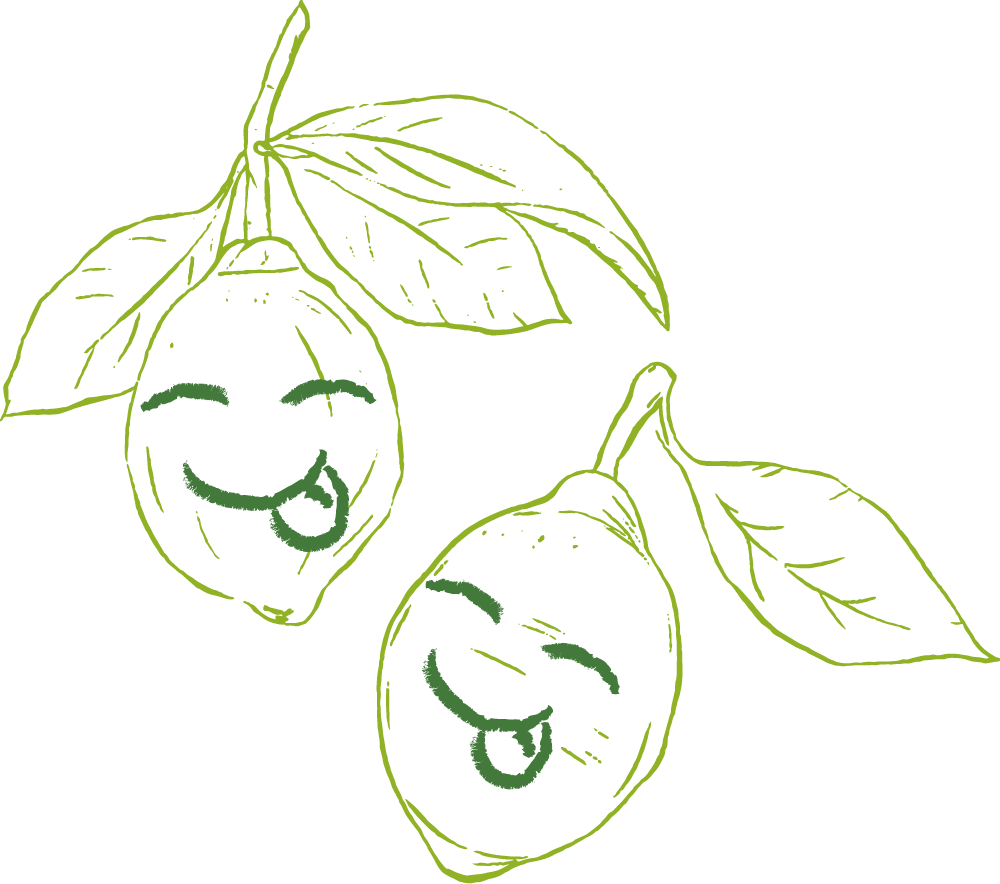
Noor was able to carefully and playfully create the characters that would carry the Tone of Voice for the brand.

We commissioned custom Illustrations by Noor Qaba,
a female creative originally from Baghdad, Iraq.
Noor created a world in which the herbs came to life. The idea that herbs are the spice of life itself, inspired us to think about how they can carry a bit of personality and sass into the brand.


